-
Architects: Agence Bernard Bühler
- Area: 3658 m²
- Year: 2010
-
Photographs:Vincent Monthiers , Agence Bernard Bühler

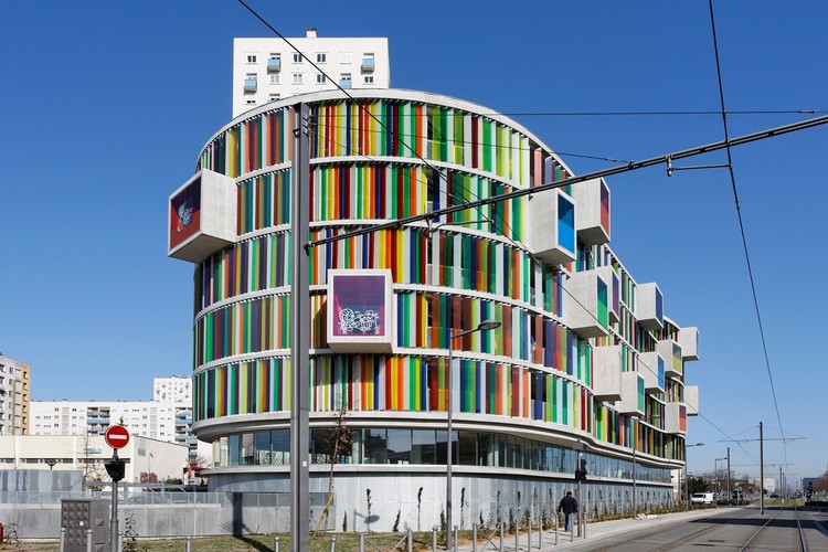
Text description provided by the architects. Positioned at an intersection and near a shopping center, it must manage its urban context, the flow of cars, tramway flows and thus pedestrians flows. This concentration has led to the creation of a square mineral easing movement and allowing the building to sit in the continuity of the public domain.
- The ground floor: A grid of expanded metal wraps and mask a parking on half level of around thirty parking spaces. The grid that protects the ground floor of shots and theft will be a support for climbing plants.

- The R+1: This level is fully glazed office space. He comes to transition between the ground (traffic, pedestrian) and dwellings.

- R+2 and R+6: 5 levels of bands of colored glass STADIP, divided by the floor, wrap the housing part of the collective. Colored boxes out of the front and just break the rhythm of stained slides. We will see later that these advances are extensions of terraces or appartments.
.jpg?1370908823)


.jpg?1370908804)
.jpg?1370908807)
.jpg?1370908817)
.jpg?1370908823)
